I’ve been meaning to write up a bit of where I’m at with WordPress – which, if you don’t know, is the web-based website making tool that I do most of my work and blogging with.
I’ve been using and developing with WordPress for about 10 years now. I know it quite deeply, and I have opinions. And some big changes are coming up.
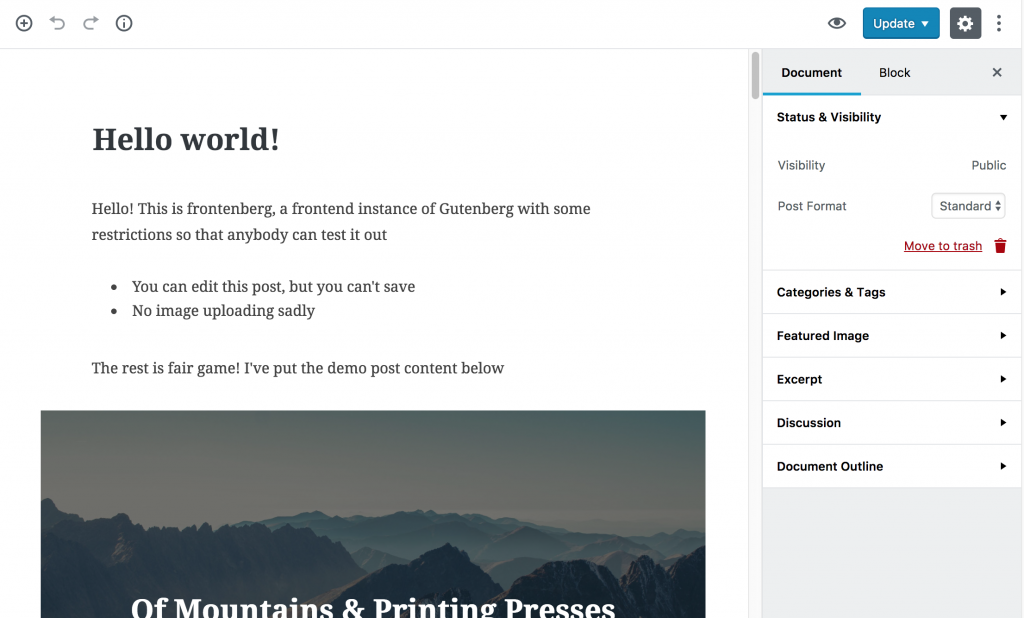
Today, I want to talk about “Gutenberg”, which is the whizzy new “block-based” editor that is coming up in WordPress in the new year. I won’t describe it in detail because that’s been done elsewhere, but if you’ve used SquareSpace or Medium, it’s quite a bit more like that. If you want to actually try it out then someone cleverly made a way for you to do just that.

Some of you will be expecting me to dive into a deep discussion about my thoughts as a developer/coder and meta-boxes and stuff like that. But that’s for another post.
Today, I was a USER of Gutenberg. I was trying to write a year-in-review post that involved a lot of copying and pasting from Facebook, and I was doing it on an iPad. Now, I know that that’s not necessarily a common use case, but I know that this wouldn’t have been too hard in the normal WordPress editor.
But wow was it hard in Gutenberg.
Then, after giving up on the iPad, I switched to my laptop to finish it off. What I found there was that, for a post that is mostly just text, images and a couple of embedded videos, Gutenberg actually gets in the way of the writing experience.
I didn’t expect this.
I’ve been trying hard to be a proponent of Gutenberg. It seems like it’s a good evolution of the WordPress software for the use case of blogging and straight-up content creation. I want to think it’s a good idea.
I also know that the team who are making it have been working REALLY hard on it, engaging fantastically well with those who are testing and critiquing it, and that it’s still a work in progress and could still end up being the amazing writing tool that I want it to be.
I’m also aware that I’m an a-typical user. I like to use my keyboard to write, without touching the mouse, and love the markdown-like shortcuts for headings and code and so on that were recently added to the WordPress editor. AND I know that there are some keyboard shortcuts, but I’ve not learned them yet (Where is the reference? Maybe not there yet.)
But there was just something about all the extra user-interface popping up everywhere. The way that hovering over any paragraph made all these controls appear (a block for each paragraph creates too many pop-up controls). The way that the new-block interface and the block options are present so much of the time.
I just wanted to write – and, I’m sad and sorry to say, Gutenberg got in the way, confused me, and I just wanted to turn it off.
If a power user – someone who uses WordPress a lot and has high hopes for Gutenberg and wants to like it – finds it intrusive and complicated, then what will that mean for the every-day blogger?
Gutenberg still has work to do to win me over. I hope the team building it can make it right.