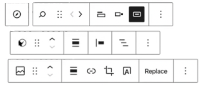
Blocks are a new paradigm. They need complex new user interfaces. And we don’t have a common visual language for them.
I’m spending my Saturday morning “TV” time watching the WordPress “Full Site Editing” demo.
Now… I should say some things up front.
- I’m an old dude now. I don’t like change. I’m also a sensitive person who thinks things through deeply. I doubly don’t like change. I know this.
- I have every respect for the people designing and building the block editor. It’s a complex piece of software with a complex interface. What they are doing is hard.
- I’m well aware that this is unfinished work.
But … I’m watching this video, and I’m completely baffled about what is going on. There is lots of talk of refining the UI in the video, of stuff that needs to be done before this is ready. But I’m so confused. And I’m an expert at this stuff who is confident with IT and computers and things.
So what is wrong?
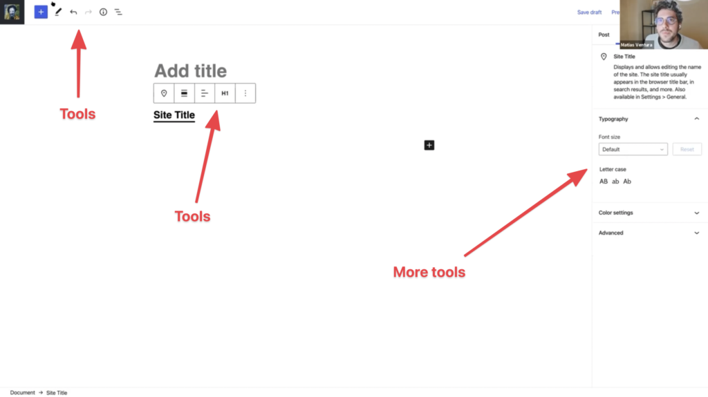
I’m looking at the UI of this thing. The myriad icons.

The primary, secondary and tertiary tools for blocks that appear scattered across the inline interface, the pop-up toolbar (which I have hated since day one), and the sidebar.

And I want to be able to understand and use these tools.
So I’m thinking: why is this so hard. The classic editor was so much easier.
And the classic editor was partly easier because it was simpler. But it was also easier because it was familiar. I could say to people “It’s just like Microsoft Word” and they understood. Because the tools and icons were familiar.
What we dont have right now is a common visual language for all this block editing interface. And I think that WordPress is forging its own path rather than replicating something that already exists.
Perhaps WordPress’s editor will become the new “standard” block editor interface. Perhaps, in future, we will say to people “It’s just like WordPress”.
But right now we are making new things that haven’t existed before. They are WAY more complex than what we had before. And we lack a known visual language for what we are making. And it’s VERY confusing.